Microsoft Excel – a spreadsheet developed by Microsoft for Windows, macOS, Android, and iOS – features calculation, graphing tools, pivot tables and the macro programming language called Visual Basic for Applications. It comes bundled as part of Microsoft Office and can be used to represent data in meaningful ways. One of the most important uses of Excel is to generate graphs, also called charts. If you are new to Excel and do not know how to make a line graph in excel, this post will teach you how to make a line graph with pictures and illustrations. Before we dive into understanding how to make a line graph in excel, let’s understand when exactly we should use line charts/graphs.
Contents

What Is Line Chart / Line Graph in Excel
A line chart or a line graph is basically a type of chart which displays information as a series of points connected by straight line segments. Line charts come in handy when you have to visualize a trend in data over intervals of time. The time is often represented chronologically on the x-axis.
If you have any data that varies over time and you know the intervals of time and the corresponding value of data at those instants in time, you can easily plot a line chart for the data. Let’s now take a look at how to make a line a line graph in excel. Follow the steps below.
How to Make a Line Graph in Excel
If you have been thinking about how to make a line graph in Excel, it’s quite difficult to get started without knowing some basic terminologies in Excel. When you start Excel, you will be presented with rows and columns that look like this:
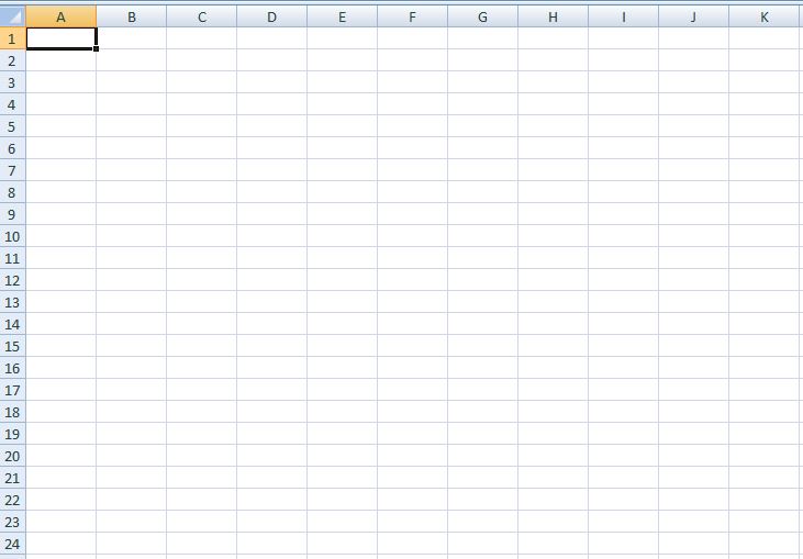
The columns are named A, B, C, D, E and so on. The rows are named 1, 2, 3, 4, 5, 6 and so on. You can enter data in what are called “cells” – that correspond to a particular row and column. For example, the one highlighted in the image above is a cell, corresponding to row 1 and column 1.
Let’s say we wish to plot a single line graph in Excel. By single line graph we mean a graph for data in two columns – one column corresponding to x-axis and the other column corresponding to y-axis. Let’s say we wish to make a line graph for the number of male students in a college for the years 2010, 2011, 2012, 2013, 2014, 2015 and 2016. If we know the number of males for each of these years, we can enter the data against each of these years. After entering, the sheet looks like this:
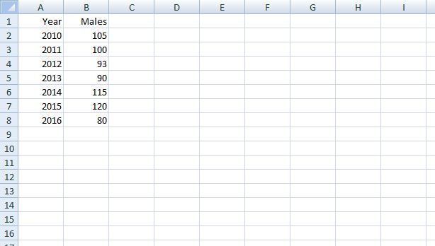
In column B, we have entered the data that will eventually become the x-axis of the line graph we are about to plot. The data for the number of males that has been entered in column B will be represented on the y-axis when we create the line graph. Once you have this data ready, follow these steps –
- Select the range of cells covering the data for all Males. In our case, the column B for rows 1 to 8 needs to be selected.
- Select Insert tab from the menu ribbon.
- You will see “Column”, “Line”, “Pie”, “Bar” and so on. Select “Line”.
- In the 2-D drop-down menu, select the first type, as shown in the figure below –
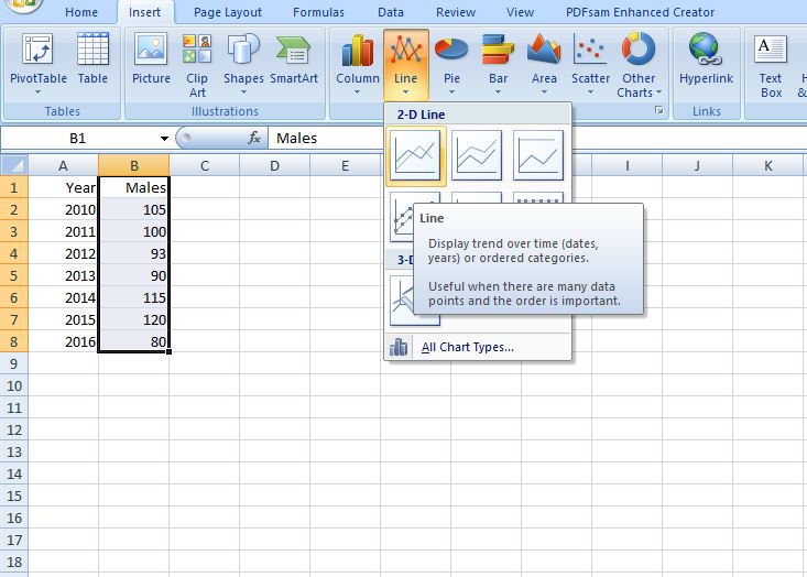
After you select the first type in 2-D line, you will see a graph that looks like this:
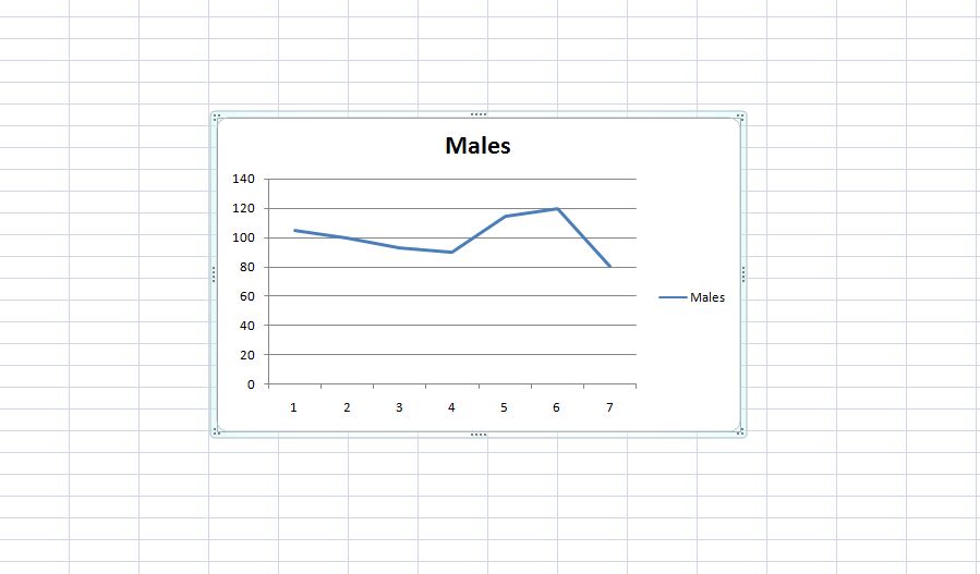
You can now see the number of males plotted on y-axis as a line graph. But wait. What just happened to x-axis data??!! Did we not want the years 2010 to 2016 on the x-axis? Well, to change the x-axis to have the year numbers 2010 to 2016 instead of 1,2,3,4 etc. follow these steps:
- Right click on the graph on select “Select Data“

- You will be prompted with a window that asks for Axis label range. Select the range of cells in Column A, since we want this to appear to x-axis, as shown below. As you select the cells in Column A, note that the axis label range field is automatically updated with values, as shown below:
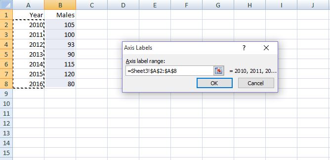
- Select OK. And followed by OK again in the next window. And voila! The x-axis of the graph gets updated with the year values, as shown below –

The answer to “how to make a line graph in Excel 2013” or “how to make a line graph in Excel 2016” is the same! This method works across most versions of Excel because the UI has pretty much remained the same since the introduction of ribbon style of menu in Excel. Now that we know how to make a line graph in Excel, let’s also take a look at how we can create multiple line graph in Excel. Check the steps below.
How to Create Multiple Line Graph in Excel
The procedure for creating multiple line graph in Excel is the same as the procedure for creating a line graph in Excel, except that you will now be selecting more than one column when plotting the graph. For example, in addition to the number of males, let’s say we now have one more column that gives information about the number of females in a class corresponding to the years 2010, 2011, 2012, 2013, 2014, 2015 and 2016. The data now looks like this –
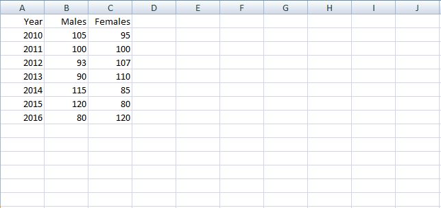
Now, instead of selecting only Column B, you will also need to select Column C, followed by Insert → Line → first type in 2-D Line, as shown below –

And now, the resulting graph will have the data corresponding to both Males and Females on the y-axis.

As you can see, the x-axis still doesn’t have the values of years 2010 – 2016. Just follow the same steps as illustrated in creating a single line graph above to change the numbers 1, 2, 3……7 to 2010, 2011, 2012,…….2016. The graph will then look like this:

Simple, isn’t it? So now you know how to make a line graph in Excel and also know how to make multiple line graph in Excel.
Before we wind up, there’s one important thing you must know – the difference between line graphs and scatter graphs.
Scatter Charts vs. Line Charts
Scatter charts are commonly used for displaying and comparing numeric values, such as scientific, statistical, and engineering data. These charts are useful to show the relationships among the numeric values in several data series, and they can plot two groups of numbers as one series of XY coordinates.
Line charts can display continuous data over time and as we saw, are ideal for showing trends in data at equal intervals or over time. In a line chart, category data is distributed evenly along the horizontal axis, and all value data is distributed evenly along the vertical axis.
If we were to plot a scatter chart for the number of males and females, the procedure is very similar. Except that you will now have to select “Scatter” from the list of graph types, as shown below –
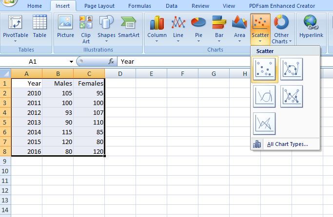
And the resulting scatter graph looks like this –
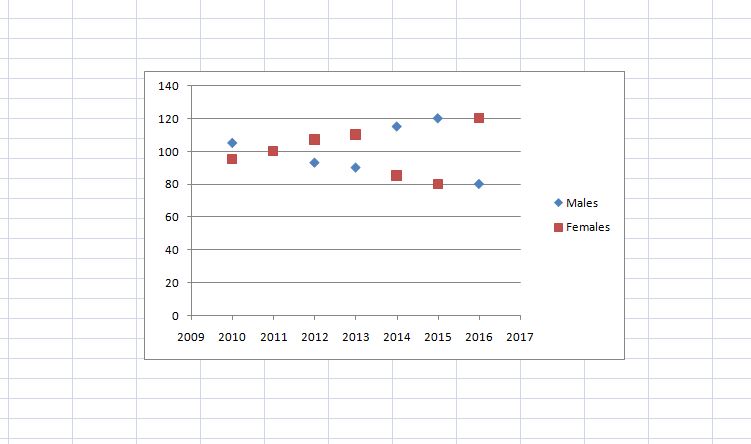
That’s it folks! Hope you now know how to create a line graph in excel. Do let us know if you faced any bottlenecks while plotting line charts or scatter charts in Excel. We’d love to hear from you!
Check Also: How to add Checkmark or Cross Symbol in Word and Excel
